Power BI Dashboard Examples
Transform your redundant data into meaningful visualization dashboards with our Power BI solutions experts
Book a free of cost consultation with our modern BI experts today
Get a FREE Consultation
Bring your data to life
Dashboards are a wonderful way to monitor your business, get quick and relevant reports, and glance quickly at important metrics. A Power BI dashboard is a one-page canvas that use visualizations to tell a story. Because the dashboard is limited to one page, a well-designed dashboard contains only the most important elements of that story.
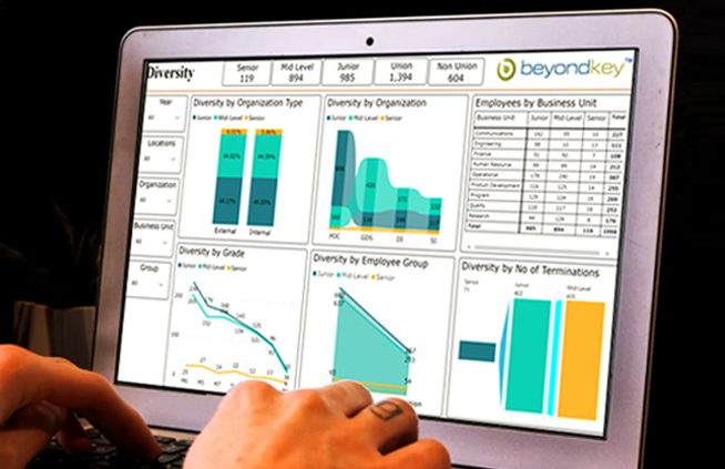
A dashboard connects different tables and columns to create a meaningful visualization. Visualization elements like charts and graphs offer an overview of any business’ operations. Dashboards are extremely important for an organization’s stakeholders since multiple departments can access single-page dashboards come allowed them to understand their business
At Beyond Intranet, our goal is to create actionable insights that inspire your team to do more for your customers and others vested in the service.
If you need a Microsoft Gold Partner to help you create your first (or 100th) Power BI dashboard, we can help.
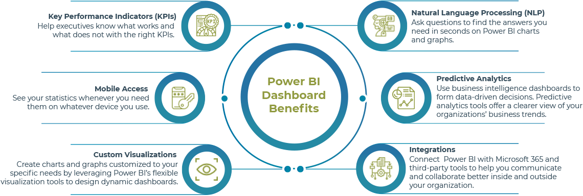
Features of Power BI dashboard
 Featured dashboard showcased as a landing page
 Combination of data from various datasets into a unified page
 Easily customize tile sizes and orders with new features like video, image, text, and web
 Data alerts on the dashboard tiles to show if certain information requires attention. goes beyond limits
 Turn data into related insights based on patterns
 Power Q&A
 Automatically refreshes when open for a long time
 Sharing & real-time monitoring


Cut through the clutter with Beyond Intranet
We help businesses drive actionable insights from redundant company data. Enabling you to make data-driven business decisions in real-time with Power BI dashboards. If compiling data is your biggest obstacle, leverage our Microsoft certified experts. Unlock complete potential of your information with our Power BI dashboard examples.
The benefits of Power BI dashboards

AI-powered analysis

Customizable interactive dashboards

Real-time informed decisions

User-friendly interface

Role-based access

Cost-effective
Power BI Dashboard Examples
Our well-versed Power BI experts have studied what specific individuals in specific roles need in a Power BI dashboard.
Let us check out how a Power BI dashboard can be used by professionals with functions like:


Why Beyond Intranet?
We have an experienced team of Microsoft certified professionals. With us, clients transform raw data into visually engaging dashboards. That too for over 17+ years.
As a Microsoft partner and global leader in Microsoft products and services, we unlock the true potential in your data.
Plan your BI journey with us!
Elements your Power BI Dashboard should comprise of
Before you start working on your Power BI dashboard, it is important to understand your audience and the dashboard goals. Once your audience is identified, you must jot down the required KPIs.
KPIs should be based on the person consuming the reports and accessing the dashboard. After selecting the KPIs, it is also important to identify how to display the data visually. You can use widgets like:
Pivot tables
Indicators
Column charts
Line charts
Pie charts
Bar charts
Donut charts
You can also customize the color schemes to make the dashboard attractive as well as meaningful.
Some of the important BI tools are:

Power BI
Microsoft Power BI is an analytics tool that helps in reporting, data mining and data visualization to provide business insights. Power BI have several inbuilt connectors that connect your data sources to real-time analytics.
You can progress to Power BI Pro and Power BI Premium depending on your enterprise needs with users ranging from small to large businesses. Beyond Key offers end to end Power BI consulting services assisting clients through all stages of the BI process from exploration to development, deployment, training, and ongoing support.
Explore our Power BI Consulting Services
Tableau
Tableau is a visual analytics engine that creates interactive visual analytical dashboards. These dashboards are easy for non-technical analysts and end users to convert the data into understandable, interactive visuals and graphs. Tableau combines the data from public sources with your proprietary data, enabling new and useful insight. Tableau saves your IT team time and effort building these dashboards with reduced technical efforts.
Explore our Tableau Consulting ServicesHeadache-inducing Dashboards?
Get clear, actionable insights with expert Dashboard Consulting.
Case Studies

Insurance company embraces Power BI dashboards to boost their sales team's productivity.
View Case Study
Leading NPO leverages Business Intelligence tools to turn data into live visualization.
View Case Study
Predictive Analytics Help Insurance Company To Predict On Policy Cancellation Rates.
View Case Study
Medical Device Company gets powerful data visualization using Business Intelligence solutions.
View Case Study

FAQs
- Featured dashboard as a landing page.
- Combines data from different sources into one page.
- Customizable tile sizes with videos, images, text, and web.
- Data alerts for attention-worthy information.
- Turns data into insights based on patterns.
- Power Q&A for instant answers.
- Automatic data refreshing.
- Sharing and real-time monitoring.
- Quick visual overview of key metrics.
- Monitoring performance and business health.
- Identifying trends and insights.
- Data-driven decision-making.
- Enhanced collaboration and communication.
- Customization based on user roles.
- Real-time sharing and monitoring.
- Dashboards: high-level visual overview, real-time data.
- Reports: detailed analysis, static and printable.
- Dashboards focus on visualizations and key metrics, while reports allow in-depth exploration and analysis.
- HR Dashboard: Improve recruitment, satisfaction, and retention.
- Financial Dashboard: Gain insights into accounting and financial data.
- Project Management Dashboard: Efficiently manage projects.
- Sales Dashboard: Identify sales patterns and predictions.
- Marketing Dashboard: Visualize metrics from various sources.
- Connect to data sources and import relevant data.
- Design visualizations with charts and graphs.
- Arrange visualizations on a single page layout.
- Add filters and interactive features for user experience.
- Apply formatting and colors for visual appeal.
- Publish and share the dashboard within the organization.
- Continuously monitor and update the dashboard with new data.
Hire Power BI Consultants
Want to leverage the hidden power of your data and have a 360-degree view of your business?